The Evolution of Logo Design: From Traditional to Modern
Logo design has come a long way over the years. From the traditional and intricate designs of the past, to the sleek and simplistic aesthetic of modern logos, the evolution of logo design reflects the changing tastes and visual language of society.
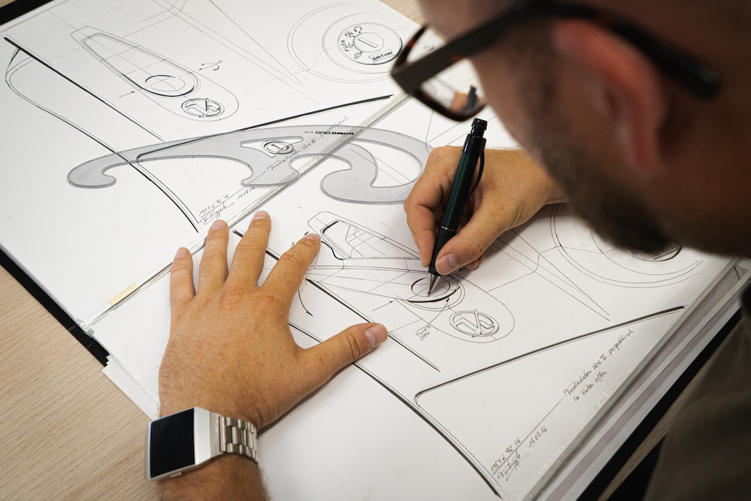
In the early days of logo design, traditional elements such as detailed illustrations, ornate typography, and complex color schemes were prevalent. These logos were often intricate, reflecting the attention to detail and craftsmanship of the time. Logos were seen as a symbol of prestige and were meticulously hand-drawn or painted, resulting in unique and highly personalized designs.
As technology advanced, logo design started to take a new direction. The introduction of computer software enabled designers to experiment with different styles and techniques. The rise of digital design brought about clean lines, simple shapes, and bold colors. Logos became more streamlined and easily reproducible. Brands began to focus on creating memorable visuals that could be easily recognized across various platforms and media.
One significant shift in logo design was the move towards minimalism. This shift was largely influenced by the rise of technology and the need for logos to be adaptable across different devices and screen sizes. Minimalistic logos often feature clean and simplified shapes, with an emphasis on negative space. This style has gained popularity due to its timeless and versatile nature, making it easier for brands to evolve and stay relevant in an ever-changing market.
Another key aspect of modern logo design is its adaptability in the digital space. With the rise of social media and online platforms, logos need to be versatile enough to work seamlessly across different mediums. Logos are now designed to be responsive, ensuring that they appear clear and concise on smaller screens or at different sizes. This focus on adaptability demonstrates the ever-increasing importance of online presence in today’s digital age.
In recent years, the retro and vintage style has made a comeback in logo design. Nostalgia and the desire for authenticity have driven brands to adopt old-school aesthetics as a way to connect with consumers on an emotional level. The retro style often incorporates elements from past decades, such as bold typography, bright colors, and playful illustrations. This blend of old and new creates a unique and memorable logo that reflects the brand’s identity.
The evolution of logo design showcases the shifting trends and preferences of society. From the intricate and ornate designs of the past to the clean and simplified logos of today, logo design continues to evolve to meet the needs and expectations of brands and consumers alike. Whether it is through minimalism, adaptability, or retro aesthetics, logo design serves as a visual representation of a brand’s identity and values, ultimately leaving a lasting impression on its audience.
